I redesigned the Les Mills homepage and app, focusing on usability, brand consistency, and scalability. I developed a design system and ran testing in Maze to ensure intuitive, effective designs, blending quick UX improvements with forward-thinking design.

Project description
Project description
Project description
Our client, a leading technology company, aimed to revolutionize scheduling processes worldwide by introducing the world's first AI-powered scheduling app.
Our client, Les Mills, wanted a fresh, forward-thinking revamp of their homepage and a broader vision for how the app could evolve to better serve instructors and stay ahead of digital trends.
Our client, Les Mills, wanted a fresh, forward-thinking revamp of their homepage and a broader vision for how the app could evolve to better serve instructors and stay ahead of digital trends.
Timeline
This project spanned from December 2021 to June 2023, with my involvement shifting based on sprint needs, Jira tickets, and evolving priorities. While not continuous, I was able to jump in quickly when needed, manage fast turnarounds, and stay aligned with the team throughout different phases.
This project spanned from December 2021 to June 2023, with my involvement shifting based on sprint needs, Jira tickets, and evolving priorities. While not continuous, I was able to jump in quickly when needed, manage fast turnarounds, and stay aligned with the team throughout different phases.
Background
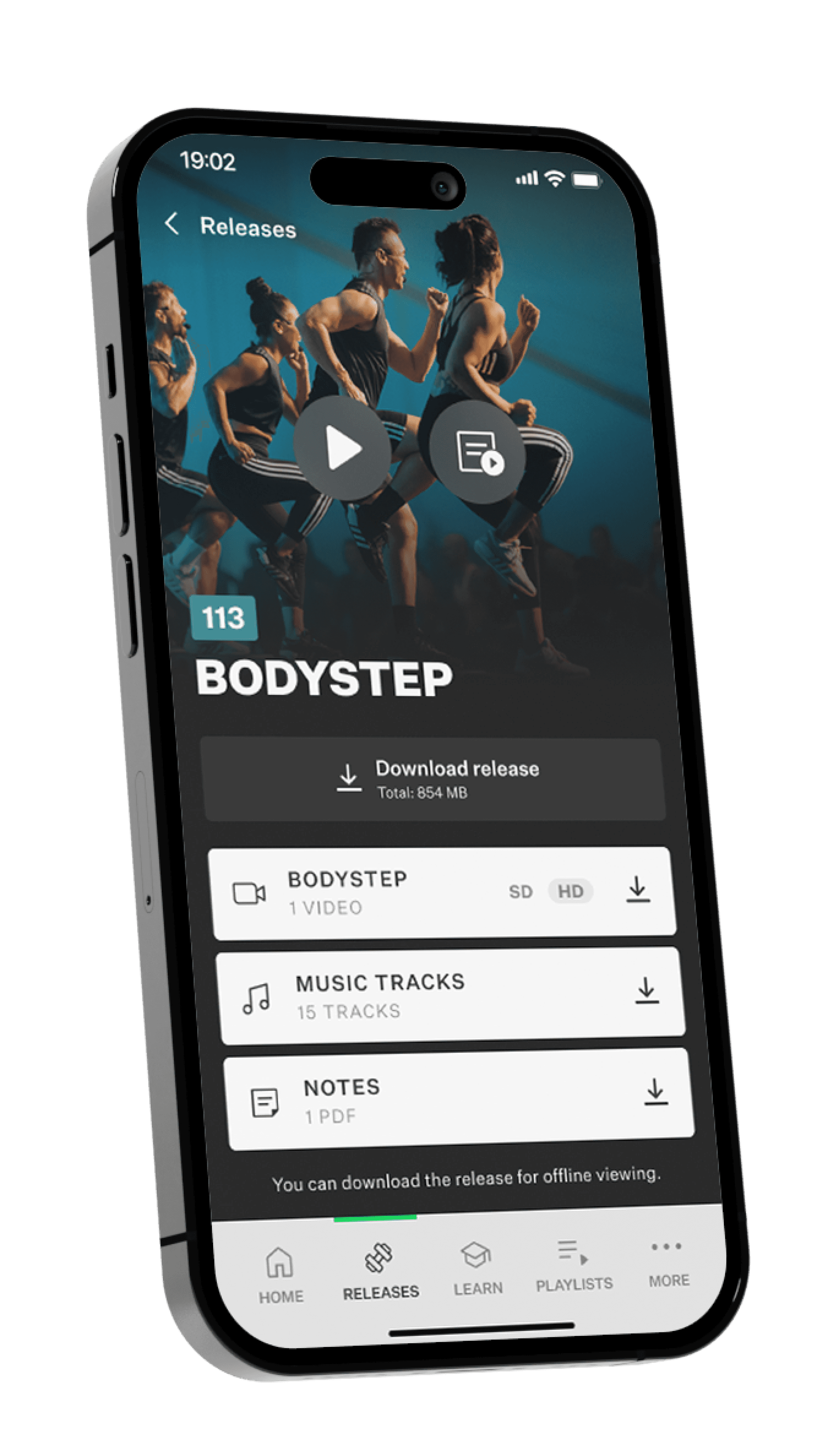
The Les Mills Releases app is designed for certified Les Mills instructors. It gives them access to the latest program releases, including:
Workout videos
Full class choreography with instructor demonstrations.
Music tracks
Licensed music for each release.
Choreography notes
Step-by-step breakdowns for learning and teaching.
Offline access
So instructors can download content and prep on the go.


Solution
Solution
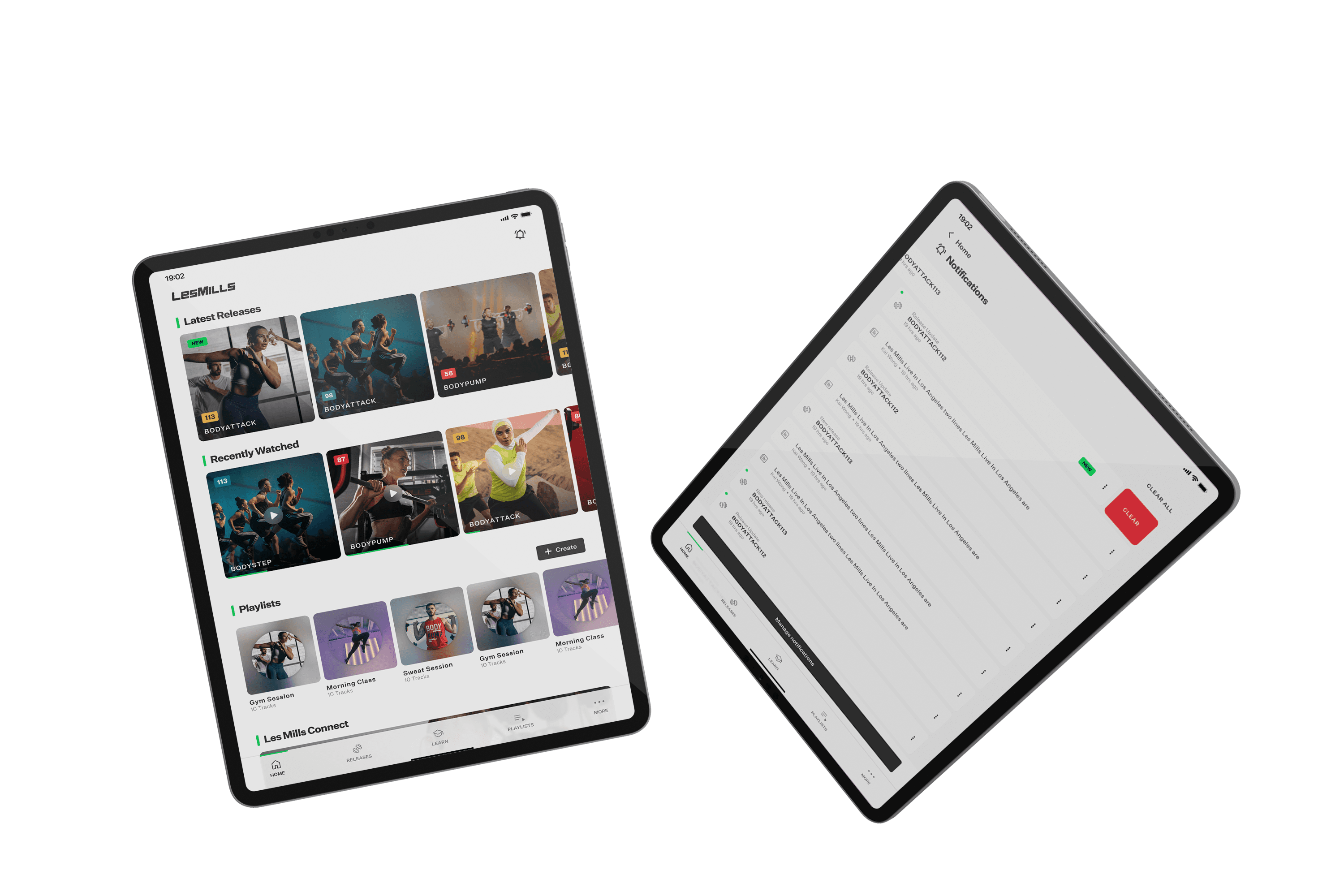
By streamlining the layout and prioritizing user experience, I transformed the homepage into a more engaging and intuitive part of the app.
Decluttered Homepage
Simplified layout for better user focus and engagement. Added more spacing to create a breathable, comfortable design.
Enhanced Engagement
Made the homepage a more attractive part of the app to encourage user interaction.
Reordered Components
Prioritized components based on importance and usage for a more intuitive flow.
Formatted Sections
Divided content into clearly organized sections for easier consumption.
User Testing
Conducted real user tests to understand actual needs and preferences.

User Persona
Engaged Fitness Enthusiast
Behaviour
Frequently uses new releases and recent playlists—these features must be easily accessible.
Prefers streamlined interfaces that reduce unnecessary steps or clutter.
Enjoys personalizing the app to better suit individual preferences.
Frequently uses new releases and recent playlists—these features must be easily accessible.
Prefers streamlined interfaces that reduce unnecessary steps or clutter.
Enjoys personalizing the app to better suit individual preferences.
Overview
An active, goal-driven fitness enthusiast who values convenience and efficiency in their digital experiences. Prefers modern, intuitive designs that allow for quick access to relevant content with minimal distractions.
Overview
An active, goal-driven fitness enthusiast who values convenience and efficiency in their digital experiences. Prefers modern, intuitive designs that allow for quick access to relevant content with minimal distractions.
Overview
An active, goal-driven fitness enthusiast who values convenience and efficiency in their digital experiences. Prefers modern, intuitive designs that allow for quick access to relevant content with minimal distractions.
Experience
New Users:
Tend to explore the app more, valuing engaging onboarding that supports their initial experience.
Long-Term Users:
Prefer a more focused, goal-oriented navigation, with fewer distractions and quicker access to frequent features.
New Users:
Tend to explore the app more, valuing engaging onboarding that supports their initial experience.
Long-Term Users:
Prefer a more focused, goal-oriented navigation, with fewer distractions and quicker access to frequent features.
Experience
New Users:
Tend to explore the app more, valuing engaging onboarding that supports their initial experience.
Long-Term Users:
Prefer a more focused, goal-oriented navigation, with fewer distractions and quicker access to frequent features.
Thinking
Prefers streamlined interfaces that minimize the number of taps to reach desired features.
Interested in customizable options such as light/dark modes and personalized components for a tailored experience.
Thinking
Prefers streamlined interfaces that minimize the number of taps to reach desired features.
Interested in customizable options such as light/dark modes and personalized components for a tailored experience.
Thinking
Prefers streamlined interfaces that minimize the number of taps to reach desired features.
Interested in customizable options such as light/dark modes and personalized components for a tailored experience.
Doing
Frequently engages with new releases and recent playlists, these features should be easily accessible.
Seeks a layout that prioritises relevant content, minimising distractions like weather updates or welcome messages.
Values the ability to personalise the app based on individual preferences.
Frequently engages with new releases and recent playlists, these features should be easily accessible.
Seeks a layout that prioritises relevant content, minimising distractions like weather updates or welcome messages.
Values the ability to personalise the app based on individual preferences.
Motivations
Seeks quick, efficient access to content.
Values personalization, such as light/dark mode and tailored components for a more customized experience.
Seeks quick, efficient access to content.
Values personalization, such as light/dark mode and tailored components for a more customized experience.
Doing
Frequently engages with new releases and recent playlists, these features should be easily accessible.
Seeks a layout that prioritises relevant content, minimising distractions like weather updates or welcome messages.
Values the ability to personalise the app based on individual preferences.
Motivations
Seeks quick, efficient access to content.
Values personalization, such as light/dark mode and tailored components for a more customized experience.


SLACK
Communication
Communication
Communication

MAZE
User Testing
User Testing
User Testing
FIGMA
UI/UX Design
UI/UX Design
UI/UX Design

JIRA
Project Management
Project Management
Project Management

PHOTOSHOP
Mockups
Mockups
Mockups
Process
Process
This category details the step-by-step approach taken during the project, including research, planning, design, testing, optimisation, and development phases.
Research & Planning
Research & Planning
Research & Planning
Reviewed Jira tickets and client requests to identify priorities and shape a focused project plan.
Design & Prototyping
Design & Prototyping
Design & Prototyping
Created two design approaches to give users a wider range during testing, focusing on clarity, hierarchy, and visual balance.
Testing & Optimization
Testing & Optimization
Testing & Optimization
Ran usability tests in Maze to gather real feedback and tweak designs based on what users actually wanted.
Development & Implementation
Development & Implementation
Development & Implementation
Built a scalable design system and worked closely with developers to ensure accurate execution and seamless handoff.
Design System
Put together a flexible design system with reusable components to keep everything consistent and easy to scale across mobile and tablet.

Maze User Testing
Ran quick Maze tests to get real user feedback on flows, heatmaps, and layouts. It was super helpful for making confident design decisions early on.

Style Guide
Built out a clean, easy-to-follow style guide with all the core brand elements like color, type, and icons to keep everything feeling on-brand.

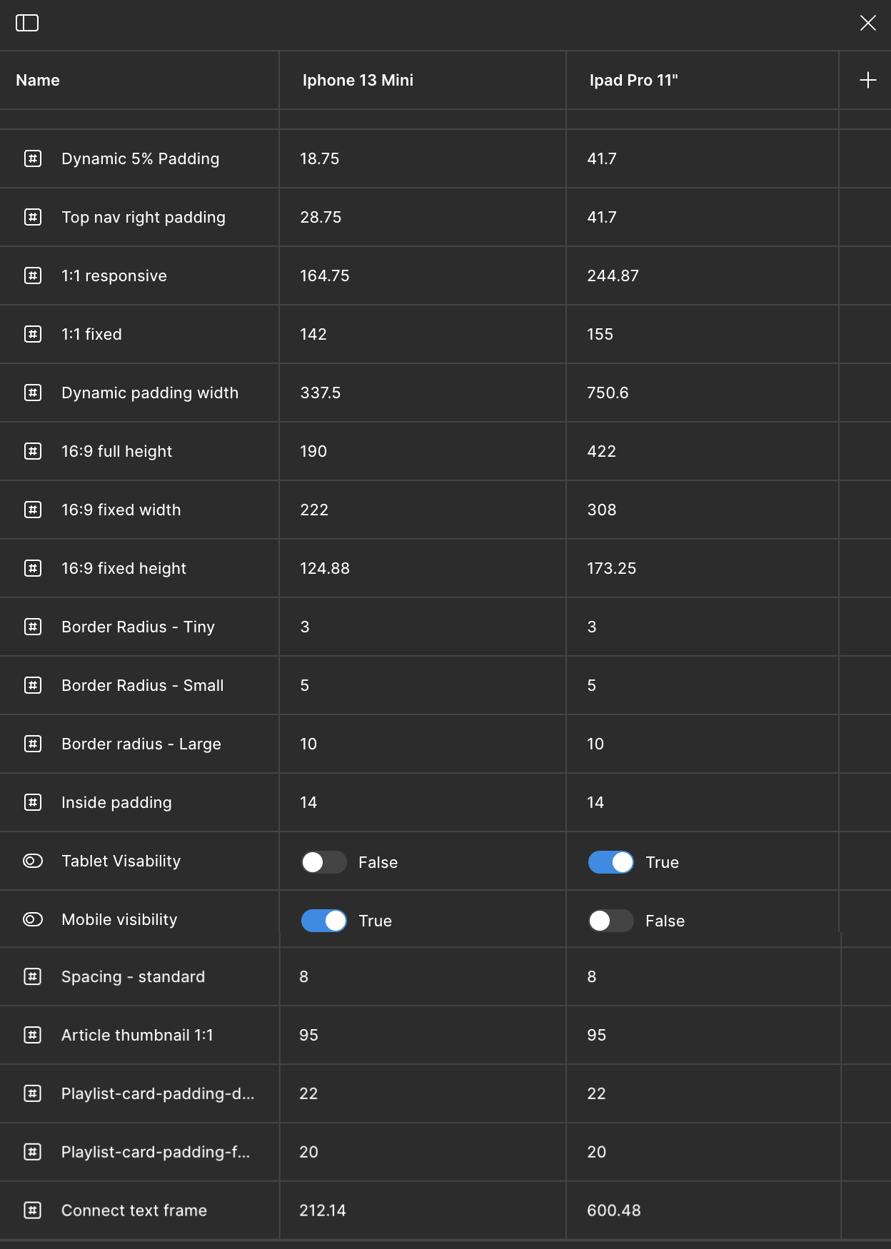
Variables
A project-specific approach to tokenization when Figma introduced variables, creating a structured framework for dynamic sizing per device.
Design System
Put together a flexible design system with reusable components to keep everything consistent and easy to scale across mobile and tablet.
Maze User Testing
Ran quick Maze tests to get real user feedback on flows, heatmaps, and layouts. It was super helpful for making confident design decisions early on.
Style Guide
Built out a clean, easy-to-follow style guide with all the core brand elements like color, type, and icons to keep everything feeling on-brand.
Variables
A project-specific approach to tokenization when Figma introduced variables, creating a structured framework for dynamic sizing per device.
Results
Results
The redesigned homepage performed well in Maze, with users responding positively to the improved layout and usability. I continued to support the project in later sprints, helping evolve the broader app experience.
Positive Feedback
Maze testing showed strong user satisfaction with the homepage improvements.
Ongoing Collaboration
Jumped into multiple sprints post-homepage to work on additional pages, flows, and feature support.
Scalable Impact
Design system and style guide supported consistency across new app sections.
Design System
Put together a flexible design system with reusable components to keep everything consistent and easy to scale across mobile and tablet.
Style Guide
Built out a clean, easy-to-follow style guide with all the core brand elements like color, type, and icons to keep everything feeling on-brand.
Variables
A project-specific approach to tokenization when Figma introduced variables, creating a structured framework for dynamic sizing per device.
Maze User Testing
Ran quick Maze tests to get real user feedback on flows, heatmaps, and layouts. It was super helpful for making confident design decisions early on.
Maze Feedback
Maze Feedback
"Looks more modern and easier to use. And more clear with different sections."
"Looks fresh and clean"
"Wow OMG i like it yeah"
"It seems nicer and makes for less taps to get to what I need most, for example the latest playlist I used."
"That was easy, and the refresh button was clear and easy to find."
"Pretty intuitive use of the feature and super straightforward as to what it does."
Conclusion
Conclusion
This project was a chance to rethink a key part of the Les Mills app and build a foundation for long-term growth. By focusing on usability, visual clarity, and real user feedback, the redesign improved the homepage experience and set the tone for future updates across the product. The process was highly collaborative—working closely with the dev team and Les Mills stakeholders through daily standups to ensure alignment and momentum throughout each sprint.
Conclusion
Conclusion
This project was a chance to rethink a key part of the Les Mills app and build a foundation for long-term growth. By focusing on usability, visual clarity, and real user feedback, the redesign improved the homepage experience and set the tone for future updates across the product. The process was highly collaborative—working closely with the dev team and Les Mills stakeholders through daily standups to ensure alignment and momentum throughout each sprint.