Freeview
App Redesign

Freeview
App Redesign

Freeview
App Redesign

I contributed to the redesign of Freeview Australia's mobile and tablet EPG app, making it easier for users to browse, discover, and watch live TV and catch-up content on the go.

COMPANY

Freeview

ROLE

UX Designer

EXPERTISE

UX/UI Design

YEAR

2022

Project description

Project description

Project description

Freeview Australia sought to enhance their mobile and tablet Electronic Program Guide (EPG) app to provide users with a more intuitive and engaging experience for browsing, discovering, and watching live TV and catch-up content on the go. The goal was to streamline the user interface and improve overall usability to better serve their audience.​

Our client, Les Mills, wanted a fresh, forward-thinking revamp of their homepage and a broader vision for how the app could evolve to better serve instructors and stay ahead of digital trends.

Our client, Les Mills, wanted a fresh, forward-thinking revamp of their homepage and a broader vision for how the app could evolve to better serve instructors and stay ahead of digital trends.

Timeline

This project spanned from December 2021 to June 2023, with my involvement shifting based on sprint needs, Jira tickets, and evolving priorities. While not continuous, I was able to jump in quickly when needed, manage fast turnarounds, and stay aligned with the team throughout different phases.

This project spanned from December 2021 to June 2023, with my involvement shifting based on sprint needs, Jira tickets, and evolving priorities. While not continuous, I was able to jump in quickly when needed, manage fast turnarounds, and stay aligned with the team throughout different phases.

Background

Freeview Australia's app provides users with access to live television and catch-up content across various networks. The app's EPG is a central feature, enabling users to navigate programming schedules and access content seamlessly. The redesign aimed to modernize the app's interface, improve navigation, and enhance the overall user experience.​

Solution

Solution

Solution

To improve content discovery and usability across the Freeview ecosystem, we introduced a set of features and enhancements that addressed real user frustrations. The goal was to create a more connected experience between mobile and TV, with clearer pathways to content and greater control over how it is surfaced.

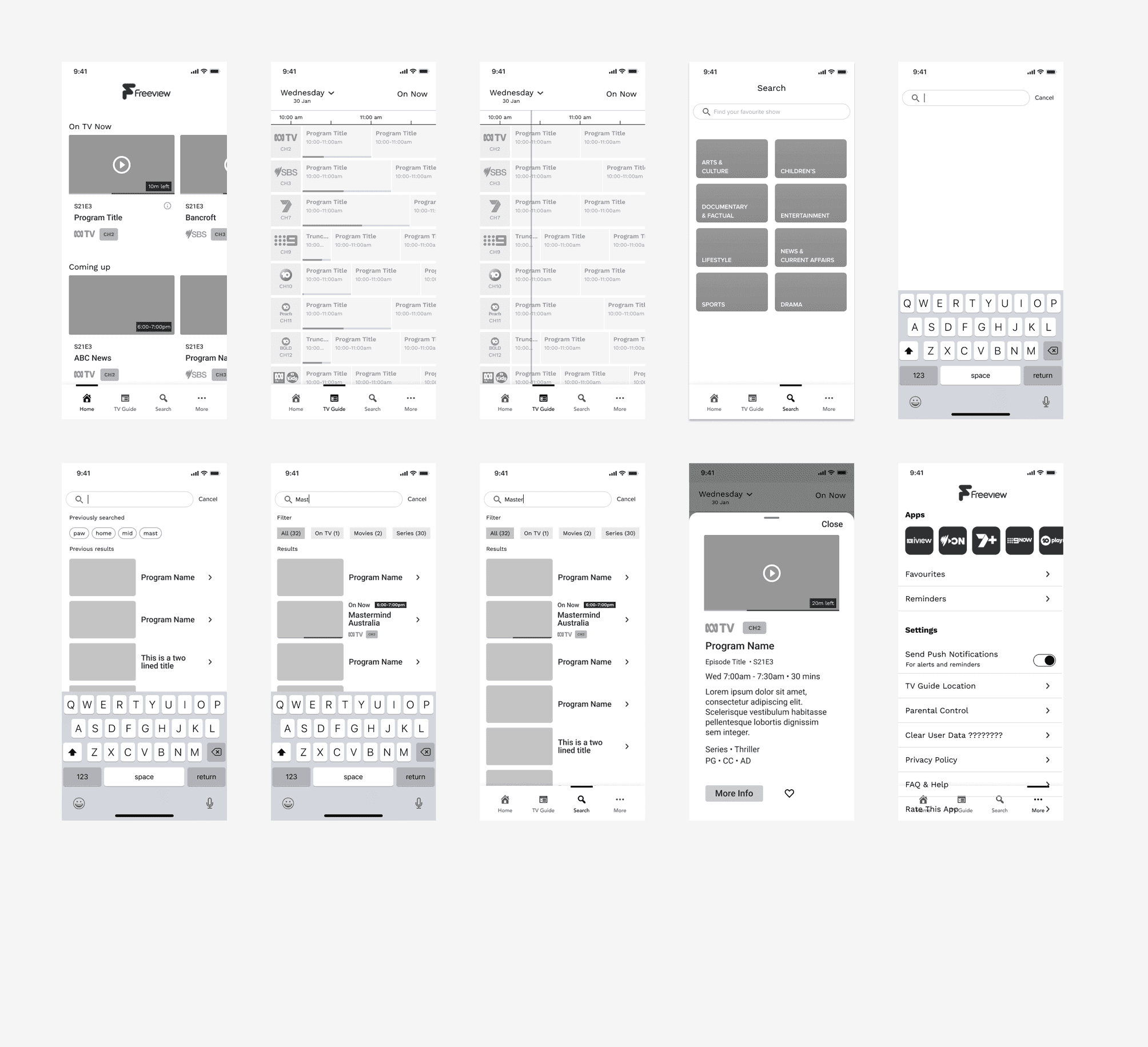
Smart Search Functionality

Search criteria was expanded to include live TV, genre, and mood. This allowed users to find content more intuitively and improved their chances of discovering something new.

Improved Mobile App Design

Navigation was restructured, onboarding was refined, and key features like reminders, favourites, and better metadata presentation were introduced to align the mobile app more closely with the TV experience.

Live and Upcoming Content Visibility

Introduced clearer indicators for what is live and what is coming up next, helping users decide quickly what to watch. This was particularly important for mobile users looking to browse casually.

Metadata-Rich Action Panels

Action panels were redesigned to show more relevant details like cast, genre, run time, and mood. This gave users the context they needed to commit to a show or movie.

Cross-Platform Consistency

Features like reminders and favourites were made accessible across devices. The aim was to create a seamless experience, regardless of where a user starts or finishes watching.

SLACK

Communication

Communication

Communication

FIGMA

UI/UX Design

UI/UX Design

UI/UX Design

JIRA

Project Management

Project Management

Project Management

PHOTOSHOP

Mockups

Mockups

Mockups

Process

Process

Process

User feedback shaped every stage of the design process. We grounded our work in real needs, validating ideas through early prototypes and iterating based on testing.

User Research Synthesis

User Research Synthesis

User Research Synthesis

Reviewed quantitative data from over 900 users along with in-app feedback. This helped us spot patterns and uncover specific issues with discoverability, navigation, and app cohesion.

Experience Mapping and Feature Planning

Experience Mapping and Feature Planning

Experience Mapping and Feature Planning

Mapped current user journeys across TV and mobile platforms to identify disconnects and friction points. Prioritised features that would improve search, content surfacing, and cross-platform alignment.

Prototyping with High Fidelity Motion

Prototyping with High Fidelity Motion

Prototyping with High Fidelity Motion

Built detailed prototypes using Figma with component-level animation to demonstrate how features like smart search, metadata panels, and cross-device sync could work in practice. These prototypes were shared in pitch videos to help clients visualise the product's potential.

Results

Results

Results

The improvements addressed key user concerns and made the product more appealing to prospective partners. Mobile usability increased, and the product narrative was clearer and more compelling for sales and demo use.

Improved Discovery Flows

Users found it easier to browse live content, find something to watch based on preferences, and get relevant information faster.

More Cohesive Ecosystem

Cross-platform consistency improved the experience for users who switch between mobile and TV, supporting Freeview’s vision of an integrated ecosystem.

User Testing Feedback

User Testing Feedback

  • “Good to have favourites.”

  • “Likes the series number mentioned above the title in the thumbnail.”

  • “The new mobile app UI is easy to follow.”

  • “Good to have favourites.”

  • “Likes the series number mentioned above the title in the thumbnail.”

  • “The new mobile app UI is easy to follow.”

  • “Prefer the new menu.”

  • “Order of the rail is good.”

  • “The new app looks better, more spaced out, unlike the current UI which is squashed together.”

  • “Prefer the new menu.”

  • “Order of the rail is good.”

  • “The new app looks better, more spaced out, unlike the current UI which is squashed together.”

  • “No required changes, happy with the proposed UI.”

  • “Preferred the new proposed bottom menu UI.”

  • “It’s cool, I don’t need to search through the TV guide.”

  • “No required changes, happy with the proposed UI.”

  • “Preferred the new proposed bottom menu UI.”

  • “It’s cool, I don’t need to search through the TV guide.”

Conclusion

The redesign of the Freeview experience successfully addressed long-standing user frustrations with discovery, navigation, and visual clarity. By introducing smarter search, a more refined mobile interface, and cross-platform consistency, the product now better meets the expectations of modern viewers.

User testing validated our direction. Feedback highlighted the improved visual layout, the ease of navigation, and the usefulness of features like ‘On TV Now’, favourites, and consistent rail ordering. These changes not only enhanced usability but also strengthened Freeview’s value proposition for future partners.

The result is a more connected ecosystem that makes it easier to find and enjoy content, no matter the device.

Conclusion

Conclusion

This project was a chance to rethink a key part of the Les Mills app and build a foundation for long-term growth. By focusing on usability, visual clarity, and real user feedback, the redesign improved the homepage experience and set the tone for future updates across the product. The process was highly collaborative—working closely with the dev team and Les Mills stakeholders through daily standups to ensure alignment and momentum throughout each sprint.